2014/Design Elements
IndieWebCamp Design
https://etherpad.mozilla.org/indiewebcamp-design
Participants
- kylewm.com
- amandamaclean.com
- gregorlove.com
- wbsrch.com
- notenoughneon.com
- psyhigh.com
Discussion
Kyle likes the simplicity of stevelosh.com and emphasis of content on (fellow indiewebbers) brennannovak.com, glennjones.net
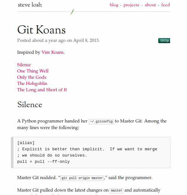
This is what was in the back of my head designing my site. elegant and minimal — Kylewm.com
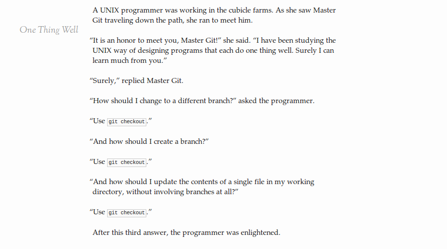
when you scroll past a section header, it fades in in the left sidebar to retain context.
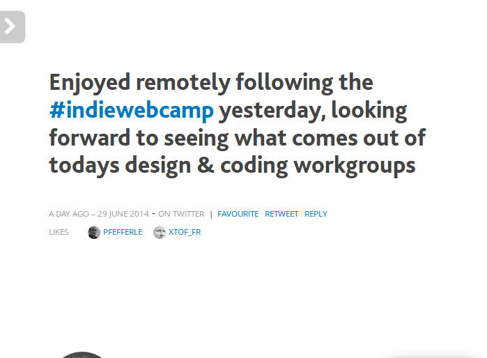
User:glennjones.net has lots of indieweb data on the post permalink page but it's instantly obvious which ones are the most important
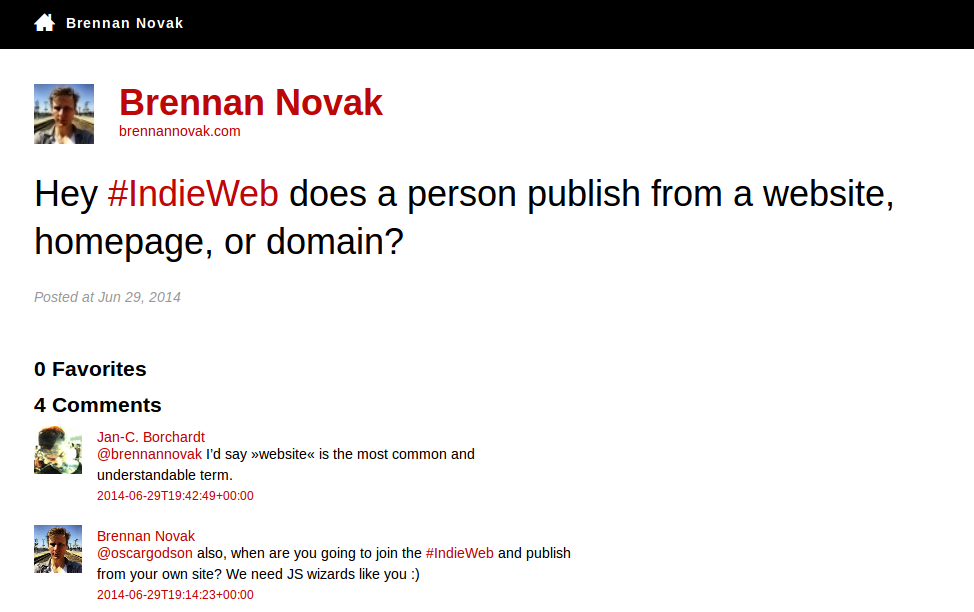
User:brennannovak.com's page is well-balanced. The navigation elements fade in a few seconds after loading, so that your eye is first drawn to the content.
Dean: what's everyone's experience of working with UX people; they seem like sort of a mythical race
design for desktop or mobile? Kyle: mostly expect desktop, try for graceful degradation to mobile
Jason: mrmoneymustache.com is a fun example of a site that has texture and atmosphere.
(thoughts added later by Kyle) part of the fun of having your own site is having it look however you want, why not make it fun and unique? doesn't have to look "professional"
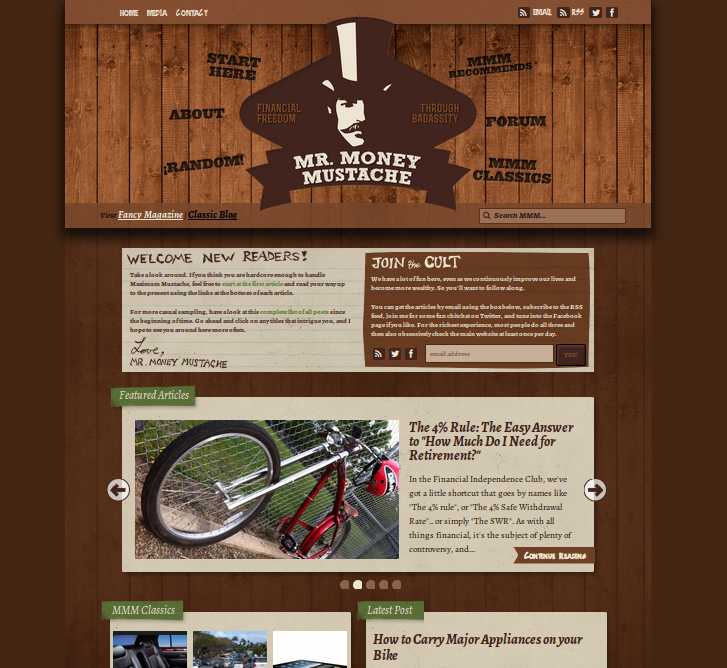
lots going on, without feeling flashy or cluttered, in contrast to the more minimalist approaches above.
public/commercial sites: don't usually focus on being pretty or particularly user-friendly. "the walmart of webdesign", public doesn't mind scraping through all that barf (looking at you Amazon)
although Amazon occasionally does something cool with their front page like replace the whole thing with a Kindle roll out
Apple sort of converges for-profit and beautiful design. doesn't hurt that all their products go nicely together.
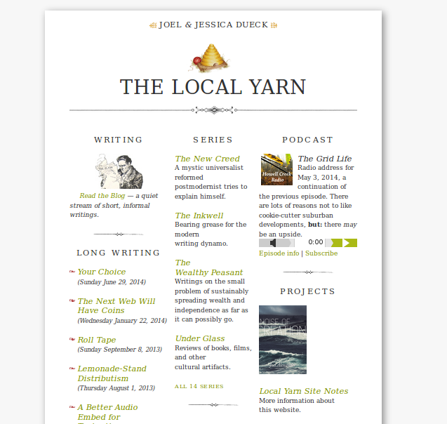
gRegor: likes thelocalyarn.com
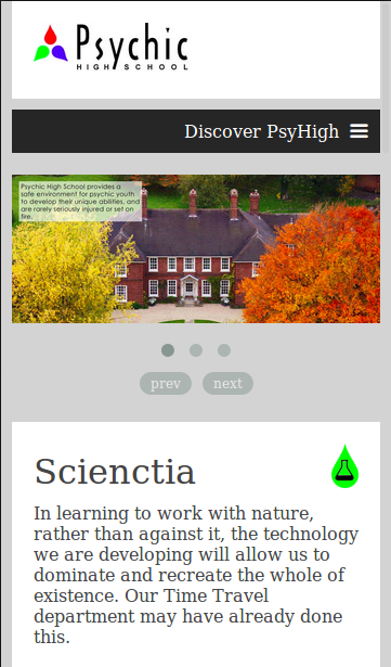
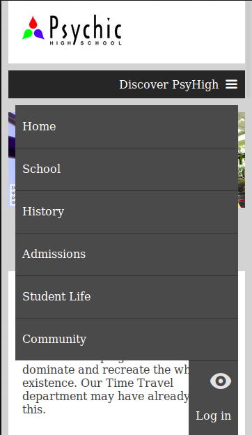
Dean: PsyHigh uses a hand modified theme from responsee.com. navigation elements collapse to a dropdown menu for mobile. Kyle thinks Known should do this ;)
emmak: fundamental problem, usability. can people find what they're looking for. notes vs. replies vs. articles -- no precedent for that that non-indieweb-people are familiar with. when I'm looking at a site, I expect:
- navigation on top
- archives (calendar view) along the right side bar
- about-me on the left sidebar
notes vs. articles - notes are basically plain-text, embed links, use italics,
Dean: notes make me think of those annotation comments on the side of https://kartikprabhu.com/article/marginalia - marginalia comments
indieweb sites built for indieweb people, aaron and tantek's site tend to influence what the rest of us do
emmak: look into facebook and twitter for inspiration
- facebook filters out friends, think they have stopped posting but just haven't clicked on them in a while
- follow some agreed upon standards, so that there is a common language across indieweb sites
wrap up: sort of corralling what indieweb represents into a set of common, recognizable components (for non-tech people)
tools/resources
Emma uses Bootstrap Blog as a base theme
Dean: responsee.com -- in a particular situation needing a site that resembles a professional, public, school website
fontsquirrel.com -- lots of free fonts with clear licenses
webtypography.net -- good resource for starting out
