calendar heatmap
This article is a stub. You can help the IndieWeb wiki by expanding it.
calendar heatmap is a 2-dimensional calendar view that shows a value over time through color coding it, often with warmer colors indicating higher values (hence heatmap).
IndieWeb Examples
This section is a stub. You can help the IndieWebCamp wiki by expanding it.
No known IndieWeb Examples currently. Do you show a calendar heatmap or activity grid on your site like the ones below? Add yourself!
- Add yourself here… (see this for more details)
Silo Examples
GitHub
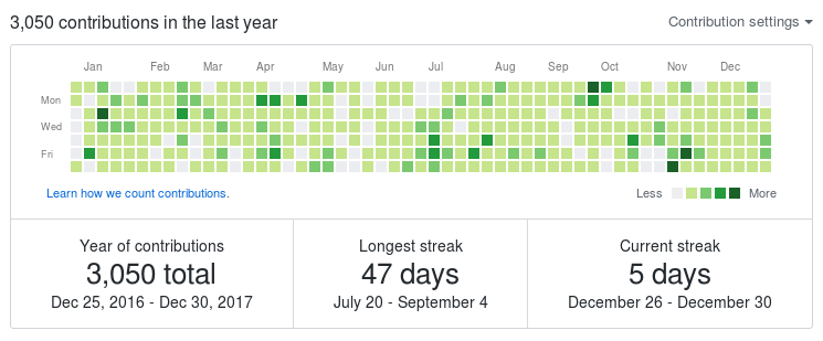
The contribution graph on Github user profiles uses light green to dark green to indicate level of contribution per day, on a 52x7 grid display of the most recent 52 weeks of contributions.
You can click on any of the squares and GitHub will show the contribution activity for that day below.
JetPack
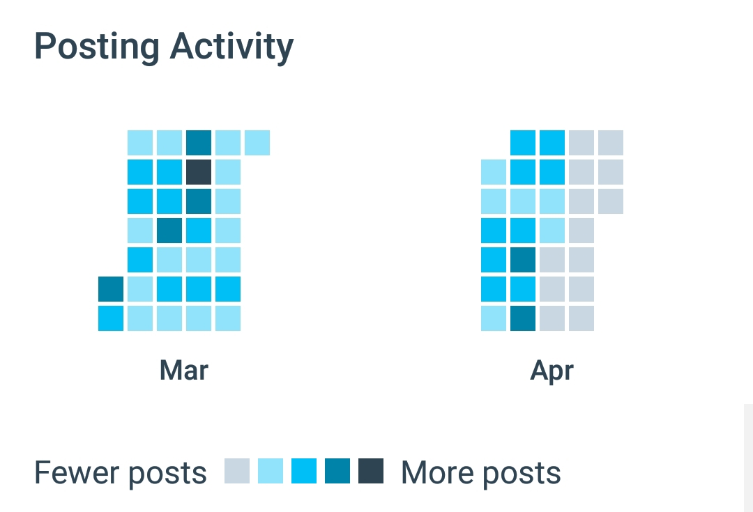
The WordPress.com mobile app (utilizing JetPack for self-hosted sites) has an Insights section with a Posting Activity pane with data spanning two months to indicate how frequently one post to their website.
Tools
Decorative
- https://github.com/gelstudios/gitfiti is open source to create graffiti in a github commit history calendar, e.g.:
Brainstorming
open source
Open source libraries that may be of use to draw heatmaps on your own site:
- Cal-Heatmap


