2014/wiki-redesign
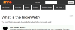
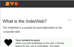
At IndieWebCamp 2014 we had a session to redesign the wiki. The new theme is currently installed on the wiki, but not set to be the default theme yet.
Preview the New Theme
- preview the new theme.
- Set your default theme to "Teahouse" in your user preferences
Contribute to the Redesign
If you want to suggest new CSS edits for the wiki, you can send a pull request to the Mediawiki skin here: https://github.com/indieweb/wiki
If you are signed in to the wiki, there is an additional style tag added on the page:
http://example.com/indiewebcamp.css
(where example.com is actually your website)
This gives you a way to make CSS edits to test things out on the real wiki with the full content rather than setting up your own MediaWiki install.
Issues
- Events and "What is indie" on every page... I only need this on the home page--
 Bret Comnes 16:14, 21 July 2014 (PDT)
 - Wiki tools should be an edit button, with the other tools a drop down. Similar to getting started menu. --
 Bret Comnes 16:14, 21 July 2014 (PDT)
 - navbar doesn't fold up properly at smaller sizes.

pills drop below the bar at medium width 
disappear altogether on a phone - line-height of textareas is very narrow (prefer ~1.4em) Kylewm.com
- no border around thumbnails
- Code boxes are hard to read/identify due to lack of boarder or background.
- Summarizing tantek:
- Wiki tools usage
- very frequent / daily: Page, Edit, History
- "Page" link is the *fastest* (muscle memory) way to go from a "Edit" state or "History" state to the current state of the page
- do wish we had keyboard shortcuts working
- rarely (once a month?) Delete, Move
- never: Discussion, Protect, Unwatch, Log out
- Wiki tools usage
 gRegor Morrill: The section "edit" links are proportionally sized. Should be the same size regardless of heading size.
Todo
- Collapse TOC on pages
- Testing on current site with plugins
- Clean up timestamps in event feed
- Remove orange underline from linked images
- Fix preference navigation tabs
Screenshot
As of 6/29/2014 -- http://cl.ly/image/2R0z3S1C0b2X
