communication
This article is a stub. You can help the IndieWeb wiki by expanding it.
communication in the context of the indieweb refers to using your personal website as a starting point and potentially way for people to contact you.
Why
See:
How to
Make your homepage homescreen friendly
Add an icon to your personal site so that others can add your site to their home screens on their devices.
Add a contact card
Put an h-card on your home page with links to ways you want to be contacted, in your preference order.
Add a contact UI
Put that h-card on a separate /contact page on your website, e.g. at you.example.com/contact with:
- Easily recognizable / clickable icons for each link to a way to contact you.
- Optional: conditionally show/hide ways to contact you based on:
- browser device/OS
- your time of day / or how available you are to being interrupted
For detailed markup instructions, see:
For examples, see below.
URLs for contact buttons
You can use these URLs and URL schemes to make contact buttons.
These are all actual schemes in live use on currently active IndieWeb contact pages, not a comprehensive list of possibilities.
Text:
- sms: e.g.
sms:user@example.comfor an email address registered with iMessage - mailto: e.g.
mailto:user@example.com - skype: e.g.
skype:example123?chatusing a Skype name instead of example123
Call:
- facetime-audio: e.g.
facetime-audio:user@example.comusing an iCloud registered address - skype: e.g.
skype:example123?callusing a Skype name instead of example123
Video call:
- facetime: e.g.
facetime:user@example.comusing an iCloud registered address
See more URL schemes, some historical: URLs For People Focused Mobile Communication
Want to add another URL/scheme to this list?
- First add your own contact page (that uses that URL/scheme) to the #IndieWeb_Examples section below
IndieWeb Examples
IndieWeb community members with mobile-friendly contact pages with one-click/tap buttons as described.
Tantek
 Tantek Çelik is experimenting with a prototype at tantek.com/contact since 2014-11-18 (and previously at contact.html since 2014-06 at IndieWebCamp 2014)
- conditional showing of FaceTime Audio button only for iOS and MacOS (since 2022-05-27)
- previously was a FaceTime button only for iOS and MacOS (as of 2014-10-11 at IndieWebCamp Cambridge)
previous add to home screen
Dropped as of 2022-05-27 as it seems more a distraction than useful to the user:
- animated "add to home screen" instruction drop-down on first load (as of 2014-10-29 at W3C TPAC - verified on Template:hober's iPad). Lot's of fiddling, but here's the code using Matteo's "Add to Home Screen" library that worked:
<script src="/addtohome.min.js"></script>
<script>
var addtohome = addToHomescreen({
  maxDisplayCount: 1,
  detectHomescreen: "hash"
});
</script>
capjamesg
 capjamesg has a /contact page on his website at jamesg.blog/contact since 2022.
James' page shows links to his:
- Email address
- Instagram page
James also has an unlisted contact link for FaceTime.
Previous Examples
Ben Werdmuller
Ben Werdmuller used icons to link to a small handful of ways to reach him on his werd.io homepage. (2014-...-...?)
Tim Owens
Tim Owens had set up a nice indie comms page on http://timowens.io/contact/ since 2014-10-11 (at IndieWebCamp Cambridge) including:
- shows an animated "Add to Homescreen" instruction drop-down on first load.
- 404/down as of 2016-12-02 or earlier (maybe 2015?)
Other Independents
Other independent examples:
Terence Eden
See:
Where he has a similar mockup of an mobile phone home screen / app buttons UI with clickable links (with various URL schemes) for various contact methods, as well as links to his profiles on various silos and communities.
(screenshot needed)
Resources
Contact Icons
See also: FreeMyOAuth for additional common silo button images.
Projects
Lets Talk
Let's Talk is a userscript that renders h-cards in a standard format. When you go to someone’s web site, Let’s Talk shows you at a glance how to contact them and which methods they prefer. See https://snarfed.org/2014-03-10_lets-talk-userscript for more details.
Brainstorming
Three button UI
Ideally an IndieWeb contact UI (e.g. someone's /contact page) should have three buttons:
[txt] [call] [video]
(screenshot/mockup needed!)
Perhaps enabled/disabled based on sign-in, time of day, sleep status etc.
The three buttons would behave as follows:
Txt button
[txt] button -> reveal a text message entering UI:
(Sign-in) (if they're not already signed in with indieauth)
[ message text area ]
(Send)
(screenshot/mockup needed!)
Clicking the (Send) button would:
At a minimum:
- submit the message to the recipient's IndieWeb server
- the recipient's IndieWeb server would send a push notification to the recipient's currently active client devices (e.g. mobile, laptop).
Better (advantage: sender's site keeps a copy of the message)
- webaction to send a direct message
- handled by the sender's already registered indie-config handler
- the sender's own site shows a pop-up confirmation UI to send that message to the recipient
- the sender's site saves the message at a private permalink
- and sends a IndieWeb private message from their site to the recipient's site
- the recipient's website saves a copy of the private message at a private permalink
- the recipient's IndieWeb server sends a push notification to the recipient's currently active client devices (e.g. mobile, laptop).
Even better (advantage: no need for additional pop-up confirmation UI)
- have already gotten Micropub authorization from the sender at sign-in time
- use Micropub to private publish the message as a private outgoing message on the sender's website
- the sender's site saves the message at a private permalink
- and sends a IndieWeb private message from their site to the recipient's site
- the recipient's website saves a copy of the private message at a private permalink
- the recipient's IndieWeb server sends a push notification to the recipient's currently active client devices (e.g. mobile, laptop).
So people can txt you without ever leaving the web, or depending on a 3rd party site/intermediary/service/addressing system.
Fallback:
- without IndieAuth sign-in, fallback to a page of existing services
- sms, FB Messenger, Gtalk, email, Twitter DM
Call and video buttons
[call] + [video] -> initiate a WebRTC call (e.g. Firefox Hello) with only-voice or video+voice accordingly
- assuming your client browser supported that
- if not, it can fall back to a page of existing services
- FaceTime, Skype, etc.
- if not, it can fall back to a page of existing services
Ideally the mechanism for an audio call, while in-progress, could allow the caller and/or callee to opt-in to allowing for video, and if both did so, the audio call would be upgraded to audio+video.
Verb redirect URLs
Might be convenient to setup a few redirect URLs (perhaps even as a building block of said 3 button UI)
- /txt and/or /sms - redirects to an SMS: URL for you, or provides a simple SMS txting UI (similar to such UIs on mobile apps like iMessage, Google Hangouts etc.)
- /call - redirects to a FaceTime (audio) URL, or tel: URL, or provides a WebRTC start call UI.
- /facetime - redirects to a FaceTime (video) URL to make a video call
Mockups
iOS7 home page
Here are some mockups for how you could present a top level bar of communication, collaboration, and other options that feel familiar to an iOS7 iPhone/iPod user:
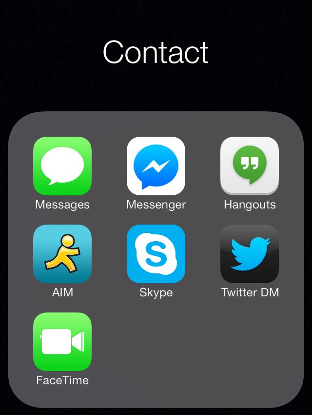
Contact expanded
When a viewer taps the Contact icon folder it expands as follows, and then the viewer can tap the mode of messaging/communicating they want to use to contact me which immediately opens a new message (txt, FB Messenger, G+ Hangouts, AIM IM), or starts a new call (FaceTime, Skype), or Twitter new direct message window. Directly to communicating - bypassing all comm app home page / activity distractors.
The one change I'd make from these mockups are some of the labels. All of the labels should be verbs, not nouns, indicating the action the user wants to take and thus reinforcing their intention.
E.g. "Messages" should be "txt message", "Messenger" should be "FB message", "Hangouts" should be "GTalk", and the rest seem to read fine as verbs.
iOS6 mockups
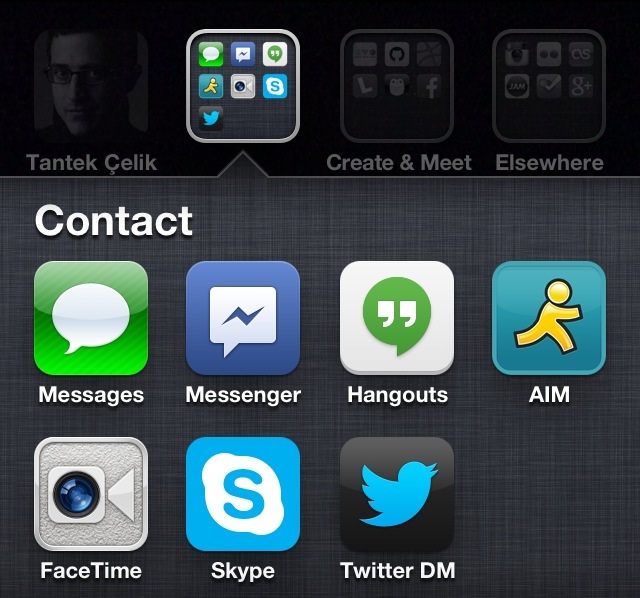
Original prototypes done in iOS6, probably not worth implementing, but may contain interesting UI ideas nonetheless:
Contact expanded
The one change I'd make from these mockups are some of the labels. All of the labels should be verbs, not nouns, indicating the action the user wants to take and thus reinforcing their intention.
E.g. "Messages" should be "txt message", "Messenger" should be "FB message", "Hangouts" should be "GTalk", and the rest seem to read fine as verbs.
Improving Install Experience
Currently sites have to use a convoluted script to attempt to prompt the user to add their comms page to the home screen AKA install it.
"Web App install banners" may be one way of improving this UX, but it requires that your comms page be / have:
- HTTPS
- have a web app manifest[1] (see sample manifest)
- short_name
- 144x144 png icon with explicit mime type of image/png
- a service worker[2] registered on the site, e.g. see the simple custom offline page example
Limitations:
- The user must visit your site "twice over two separate days during the course of two weeks."[3]
- This fails to address the use-case of meeting in person and exchanging contact (web) addresses and expecting it to be one-click "installable" upon loading the page *once*
Additional Use Cases
Authentication
When communicating from one indieweb user to another, how do you authenticate that the person you are communicating with is actually the person you think it is? This applies to messaging in general.
(This use-case is a stub and should be expanded)
Articles
Articles on some of the challenges of person-based communication:
- WIRED: Can We Talk? by . http://www.wired.com/2013/11/canwetalk/
Articles about researching and solving personal / indieweb based communication:
- : Markup For People Focused Mobile Communication
- : URLs For People Focused Mobile Communication
- 2014-03-19 Ben Werdmüller: Seeking an #indieweb alternative to Google Voice
- : Mockups For People Focused Mobile Communication
- : Building Blocks For People Focused Mobile Communication
- : Toward A People Focused Mobile Communication Experience
See Also
- homepage
- icon
- mobile
- messaging
- https://shkspr.mobi/blog/2017/04/whatever-happened-to-uri-schemes/
- https://twitter.com/socialistdogmom/status/1029933010127339525
- "the most reliable way to get in touch with me is to first contact someone i see IRL on a regular basis and hope that person shames me into responding to you on one of the many platforms i have muted." @socialistdogmom August 16, 2018
- How to make a "Slack chat" link: see Slack#See_Also for how to construct a one click "slack:" URL that others can click/tap to write you private message on the Slack instance of your choice (like on the IndieWeb Slack)
- Why you should have a contact form/page on your website, and why you should use people's personal website contact form/page to contact them (instead of random silos) https://twitter.com/MaryRobinette/status/1136663690403430400
- ""Kowal was not immediately available for comment."
Just a note... If you're a journalist and try to contact someone whose thread has 40k retweets and over 1k replies, maybe recognize that they won't see a request for comment. Try, I dunno, using their website to contact them." @MaryRobinette June 6, 2019
- ""Kowal was not immediately available for comment."
- Thread deep diving with human communication protocol analyses (without calling it that explicitly) https://twitter.com/vgr/status/1157668998588141569
- "About 10-15 years ago I had to start gently discouraging people from calling me on the phone without an appointment unless it was an emergency.
Now I’m having to gently discourage people from texting me unless some real-time coordination like a rendezvous is in progress." @vgr August 3, 2019
- "About 10-15 years ago I had to start gently discouraging people from calling me on the phone without an appointment unless it was an emergency.
- Warning: some contact info (phone number or email/AppleID) may be harvested for nefarious purposes, from time-wasting like spam, to actual security threats like installing Pegasus spyware via SMS/iMessage per https://www.theguardian.com/world/2021/jul/18/revealed-leak-uncovers-global-abuse-of-cyber-surveillance-weapon-nso-group-pegasus
The latest advances in NSO’s technology enable it to penetrate phones with “zero-click” attacks, meaning a user does not even need to click on a malicious link for their phone to be infected.
Guarnieri has identified evidence NSO has been exploiting vulnerabilities associated with iMessage, which comes installed on all iPhones, and has been able to penetrate even the most up-to-date iPhone running the latest version of iOS. His team’s forensic analysis discovered successful and attempted Pegasus infections of phones as recently as this month.
- communication-preferences


