posting graph
This article is a stub. You can help the IndieWeb wiki by expanding it.
posting graph is a visualization of post publishing frequency which can be presented in various ways like a calendar heatmap or a sparkline, and also called contributions or a contribution graph by GitHub.
IndieWeb Examples
Aaron Parecki
 Aaron Parecki on aaronparecki.com since 2016-09-27
Jeremy Keith
![]() Jeremy Keith on adactio.com since ????-??-??
Jeremy Keith on adactio.com since ????-??-??
gRegor Morrill
 gRegor Morrill on gregorlove.com originally 2016-08-25 [1]
Removed at some later point during design updates, but added back 2023-08-03 [2]:
Chris Aldrich
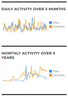
 Chris Aldrich on boffosocko.com since late 2018 uses the ActivitySparks plugin for WordPress to display sparklines for "Daily activity over the prior 3 months" and "Monthly activity over 5 years" for both posting activity as well as commenting activity. On archive pages for categories, these sparkline graphs are updated to show the activity for only that category.
- Category page example: https://boffosocko.com/category/indieweb/

Jamie Tanna
 Jamie Tanna describes how he graphs his posts in Visualising My Posting Habits. His visualization can be seen on his post frequency page.
Joe Crawford
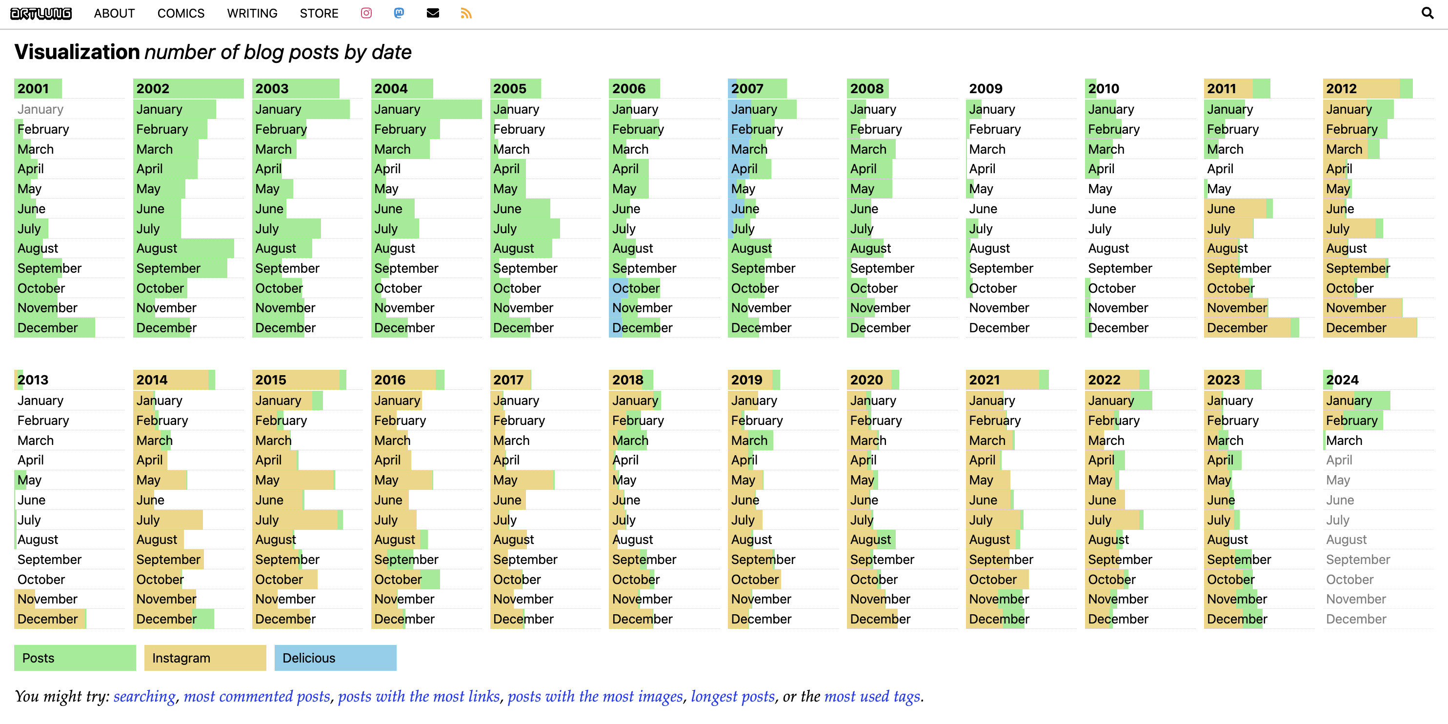
Joe Crawford has a dynamic visualization custom coded using WordPress which includes representation of the number of posts with color coding by origin PESOS. In 2021 he created a sparkline of posting frequency.
capjamesg
 capjamesg shows a sparkline that illustrates his posting frequency on his website home page:
Below this, James shows a sparkline with his IndieWeb wiki contributions. This sparkline is generated using James' MediaWiki sparkline generator.
James shows sparklines for posting activity in every category on his blog. Example:
add yourself!
- Add yourself here… (see this for more details)
Silo Examples
Archive.org
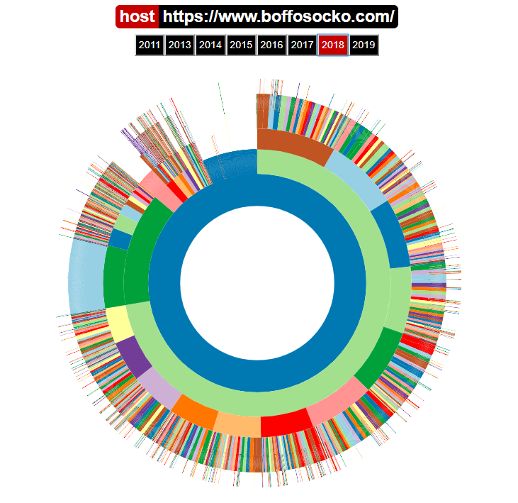
The Internet Archive has a circular user interface to represent posts and pages on an archived website which is generally organized by path names. Hovering over colored portions of their circle chart provides particular links for that site on the archive. While somewhat different presentations compared to sparklines and calendar heatmaps, this presents a lot of the same type of information and links. This incarnation also includes archive pages on a site as well as segments for tags and even URLs for individual comments for some sites. In this sense it's more like a visual version of a site map.


