logo
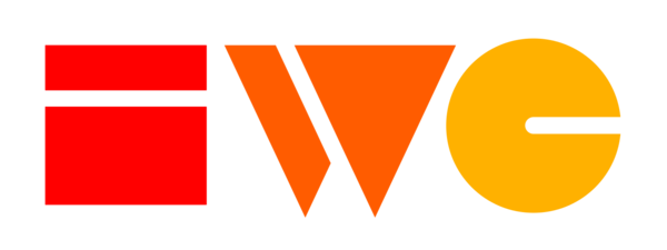
These are the official versions of the IndieWebCamp logo. (For a personal logo for your site, see icon.)
Indie Web Camp
For other versions (size, color, file formats) and additional guidelines, see the indieweb/branding and sebilasse/indieweb-origami repos on GitHub.
Full Lockup (logomark and logotype)
PNG versions.
- hexcolors #FF0000, #FF5C00, #FFB100
- Logo for ti.to banner
Logomark (no logotype)
PNG versions.
Icon
Square icon, e.g. used for favicon, social media profiles that square or circle profile photos etc. nested in a solid black border for contrast
In the wild
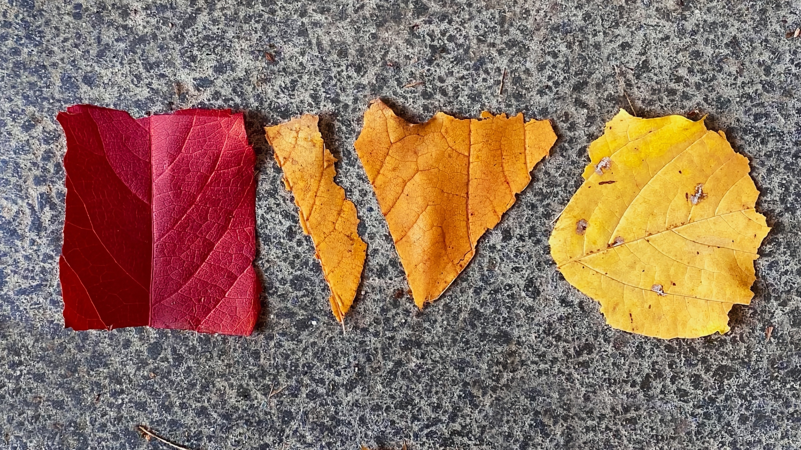
Made of leaves
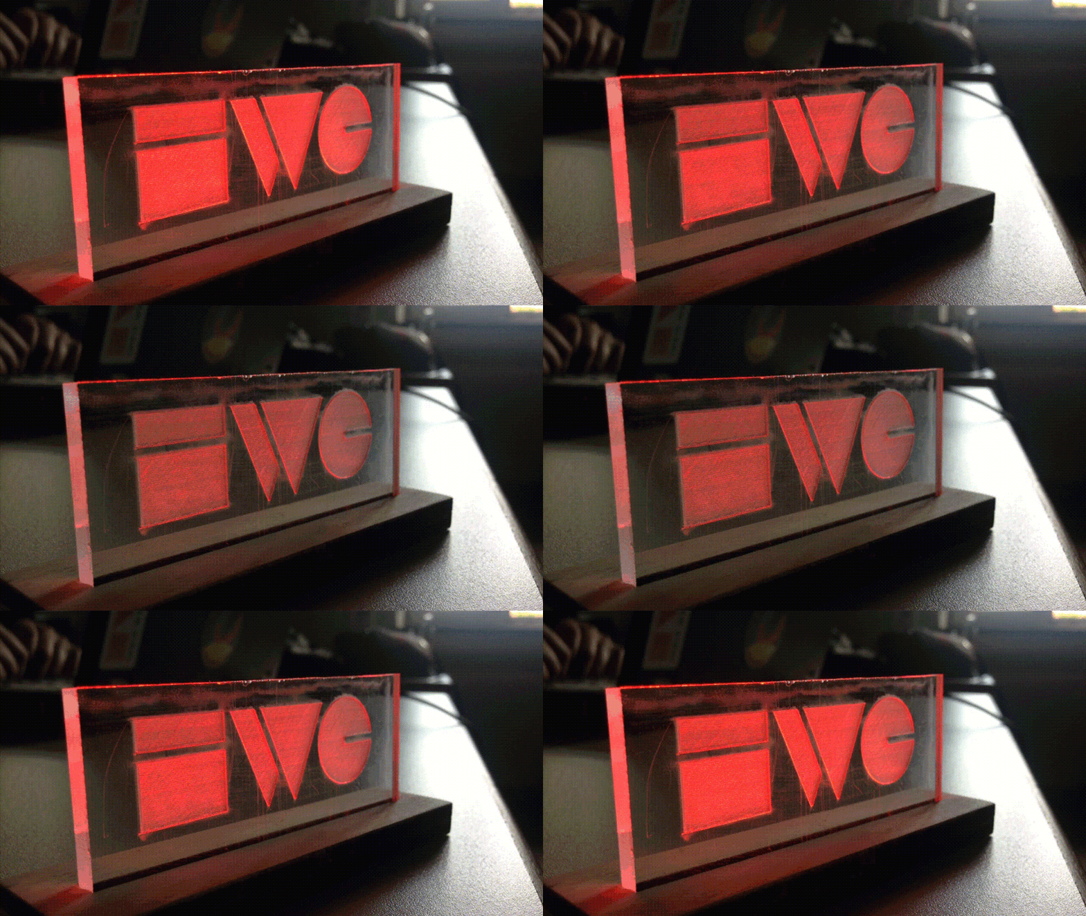
Etched illumination
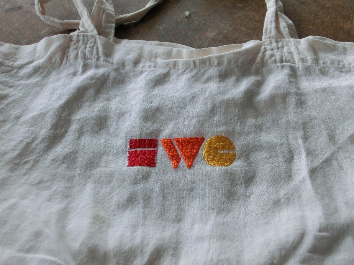
Embroidered on a bag
Indie Web
There is interest in a separate IndieWeb logo, though nothing official yet.
The most recent work is the below 2016 first proposal/draft from ![]() Shane Becker:
Shane Becker:
Background
Why is there no "IndieWeb" logo separate from the "IndieWebCamp" logo?
There's no explicit reason. Implicitly a separate IndieWeb logo would be more work that no one has had the time to work on one iteratively until it has community consensus / acceptance.
The IndieWebCamp logo was a volunteer effort in the first place, first by co-founder Crystal Beasley, then updated by ![]() Shane Becker to the current logo in use.
Shane Becker to the current logo in use.
We also switched everything from being all "IndieWebCamp" (e.g. IRC, indiewebcamp.com) to "IndieWeb", *after* the iteration of the IndieWebCamp logo, so the need (for a separate "IndieWeb" logo) didn’t really become apparent until after the fact.
Proposal
First draft Indie Web logomark (logotype, lockup and colors would come after this mark is finalized) by ![]() Shane Becker (2016-10-31).
Shane Becker (2016-10-31).

Feedback
- Please add your feedback here.
 Shane Becker
 - I am looking for an official logo, and I like the idea of something that can be a small 16 x 16ish icon. This would work if the colors were right
 Ted Tschopp
 - Years late to the party, but I think this is splendid and would look great as an icon. Would love to see an SVG version.
 Ross A. Baker
Community Contributions
Alternative IndieWeb logo approaches from community members. Feel free to add your own!
- Imitation is the highest form of flattery... designed by
 Malcolm Blaney:

Homebrew Website Club
(stub)
Where are all the Homebrew Website Club logos?
See:
Previously
See Also
- press-kit
- buttons
- icon
- Building block icons
- style-guide
- History thread: https://twitter.com/veganstraightedge/status/1383464597332512778
- "I’m still super proud of the @indiewebcamp logo that I designed in 2016 (during vanlife days) while posted up in LA (Eagle Rock, I think)." @veganstraightedge April 17, 2021
