maps
🗺
This article is a stub. You can help the IndieWeb wiki by expanding it.
Maps are representations of the real world that are often used to display the location of a post, especially for checkins, and sometimes an aspect of archive pages, showing locations (or animating travel) during the month or other time period. There are many services that can be used to put a map on your site, like OpenStreetMap and Google Maps.
The term map is also used for other representations of relationships between things. See:
- indiemap — public IndieWeb social graph and dataset
- social web map — artistic ideas for metaphorical & symbolic map of the IndieWeb, Mastoverse, Silos, and other social web related sites
IndieWeb Examples
(this section needs expansion with headings for people, and links + images of specific examples!)
There are several IndieWeb sites that display and show interesting things with maps!
 Jeremy Keith has maps of his travels since 2019-10-21
- See examples linked at Indy_web#Jeremy_Keith
David Shanske has a map view of his archives showing where he posted from
 Greg McVerry uses a gpx file, an owncloud app, and an iframe to embed maps on their website
 Aaron Parecki shows a zoomable map of his bike rides and other modes of transport, e.g. https://aaronparecki.com/2022/03/03/10/
 capjamesg has maps that plot all of the coffee shops he recommends in various cities across the UK, i.e. https://jamesg.blog/coffee/maps/york/.
 Marty McGuire shows static maps images on his checkins since 2018-06-25.
- example: https://martymcgui.re/2018/06/25/201057/
- Uses staticmaplite with tiles from Stadia's Stamen collaboration. Blog post.
Related Examples
This section is a stub. You can help the IndieWeb wiki by expanding it.
Examples related or adjacent to the IndieWeb:
- Smallweb Subway
- ...
Brainstorming
Abstract maps for data
Why:
- Privacy / blurring. Abstract maps allow a coarser presentation of data that may be more suitable for publishing publicly, instead of cartesian maps that provide precise location data.
- Simpler display, focus on non-geo data. When the data to display is more important than precise geographical relationships among the data, an abstract map helps by removing the "noise" of extraneous geographical details which would otherwise distract from the data being presented. Abstract subway maps are another example of this.
Use-cases:
- Coarse geographic "heatmaps" of your checkins per state
- Coarse geographic posts archive
US states as squares
Seven Rows
United States as a map of seven rows of squares: https://www.instagram.com/p/CBvWcWEg7JY/
- Original article: https://www.themarshallproject.org/2020/06/18/which-states-are-taking-on-police-reform-after-george-floyd uses HTML div elements for each state!
- Another article with a slightly different layout of states as squares: https://www.themarshallproject.org/2020/03/17/tracking-prisons-response-to-coronavirus


Eight Rows
United States as a map of eight rows of squares
538 election results timing
From https://projects.fivethirtyeight.com/election-results-timing/ (note the odd placement of Alaska next to / East of Hawaii, in contrast to previous maps where AK is immediately West of HI)

NYT election certification
From https://www.nytimes.com/interactive/2020/11/20/us/politics/2020-election-certification-tracker.html (note the different placement of Alaska to the top left of the continental states), change of map over time on 2020-11-20, 2020-11-23, 2020-11-24, 2021-03-31 (final state)
![]()
![]()
![]()
![]()
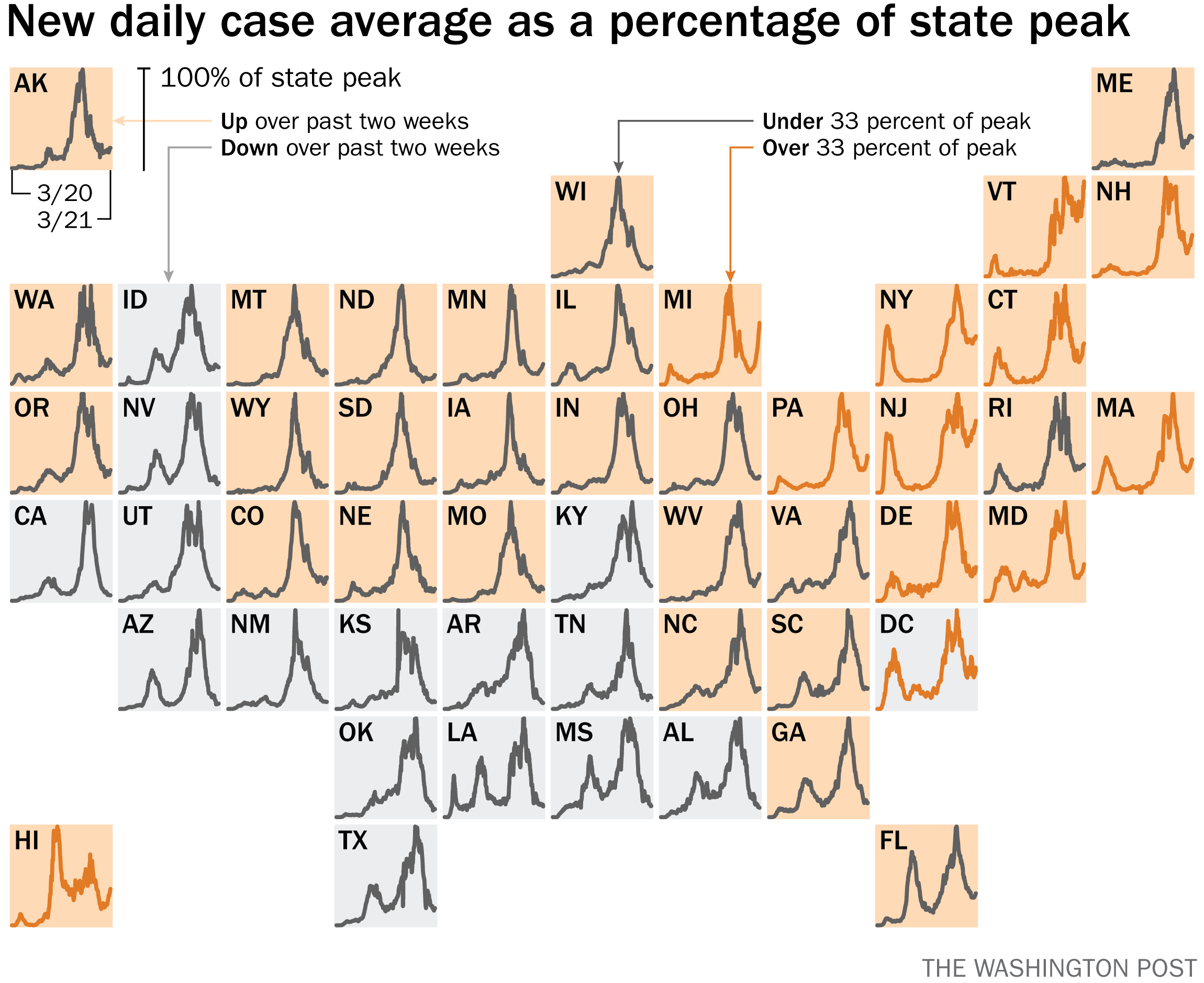
WP C19 4th wave
From https://www.washingtonpost.com/politics/2021/03/30/danger-fourth-coronavirus-wave-visualized/ (Same shape as the previous "certified results" diagrams, however note the detail graphs in each state and multiple additional dimensions of data shown)
NYT C19 4th wave
From https://www.nytimes.com/interactive/2021/04/06/us/variants-cases-spread.html (same shape as previous, data over a shorter period of 2 months instead of a year, and simpler graphs with more judicious use of color)

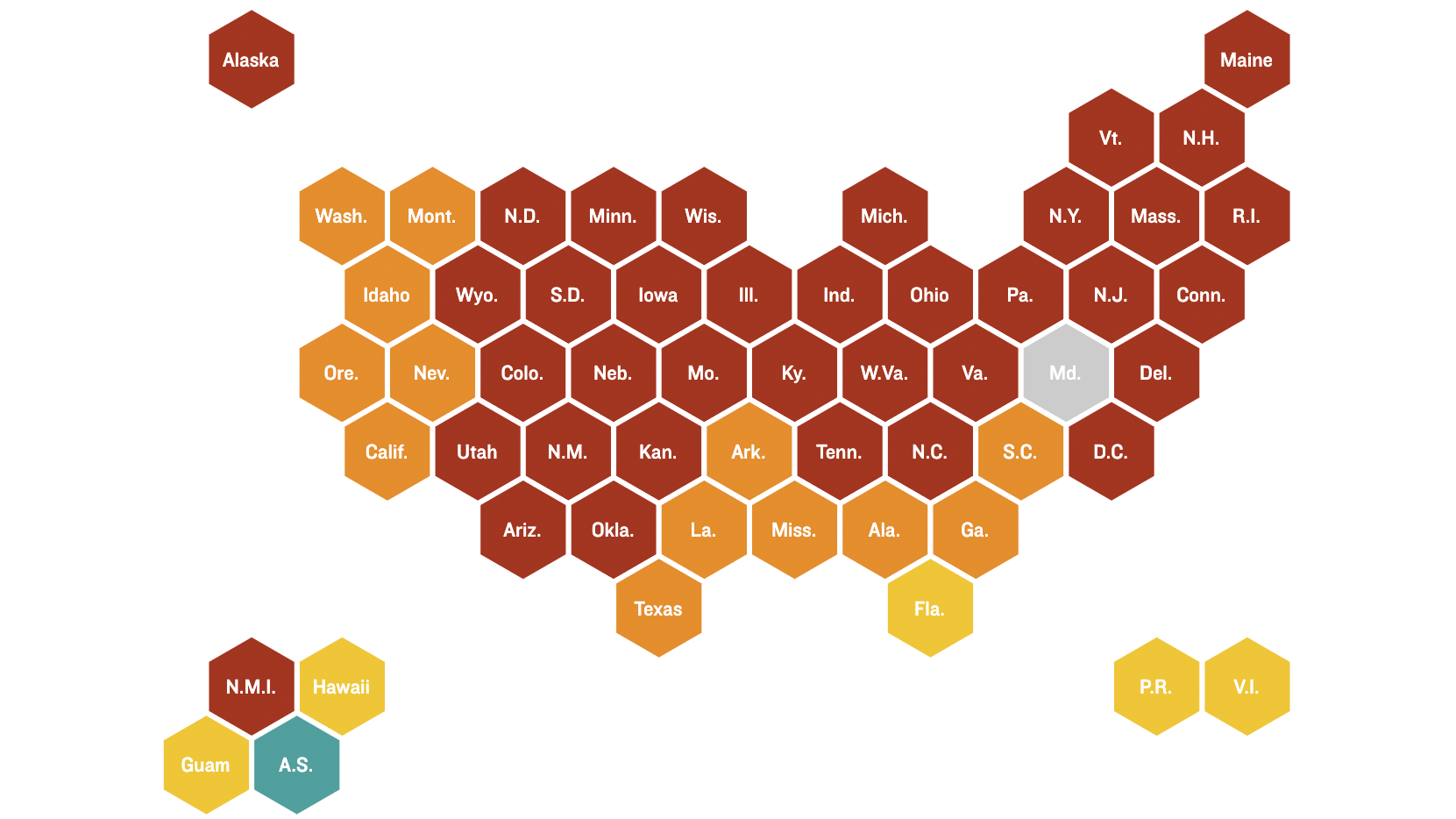
US states as hexagons
States as hexagons map: https://www.npr.org/sections/health-shots/2020/03/16/816707182/map-tracking-the-spread-of-the-coronavirus-in-the-u-s 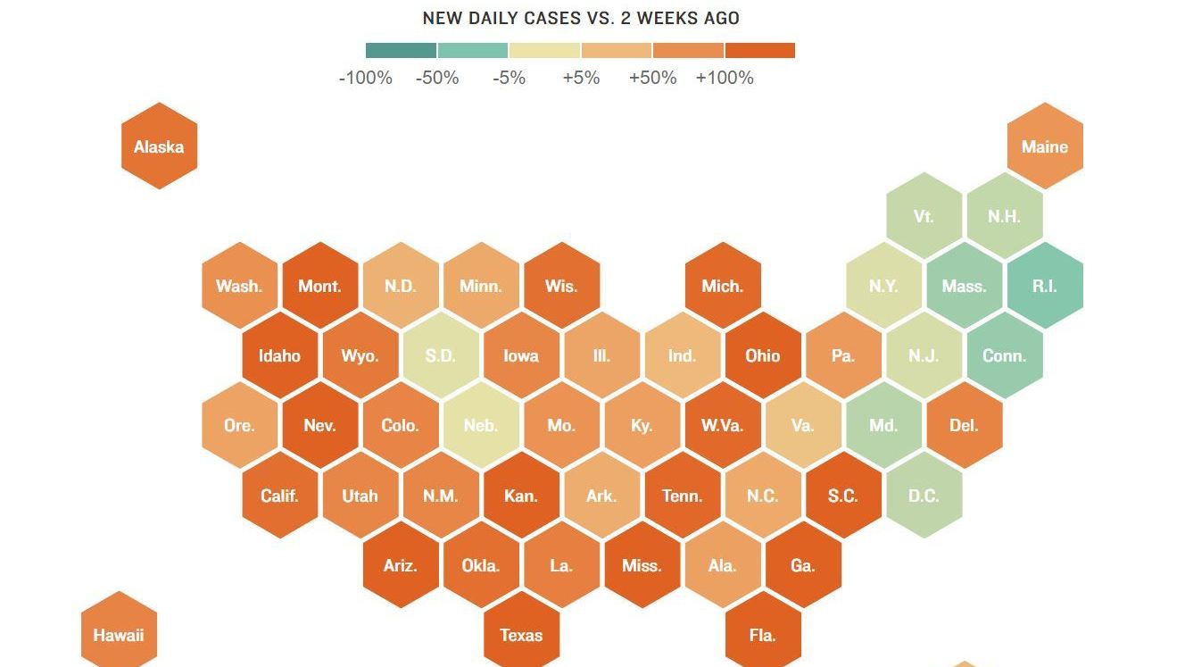
Another article: https://www.npr.org/sections/health-shots/2020/05/30/865413079/what-do-coronavirus-racial-disparities-look-like-state-by-state 
Different site, with same tiled hexagon shape for continental 48 states, and use of two-letter abbreviations, though with Alaska and Hawaii tucked in immediately above / below the tiled 48 to narrow the overall width vs. height necessary: https://missionlocal.org/2022/03/san-francisco-is-now-boycotting-most-of-the-united-states/ 
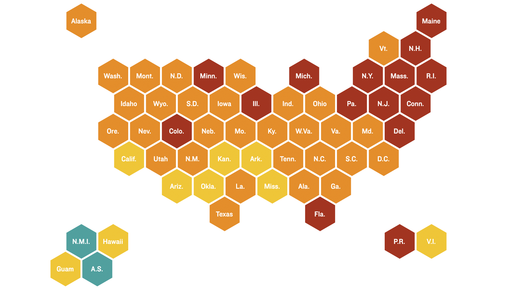
US states and territories
United States and territories as a map of ten rows of hexagons
From https://www.npr.org/sections/health-shots/2020/09/01/816707182/map-tracking-the-spread-of-the-coronavirus-in-the-u-s. Though the article is apparently from "2020-09-01", the left image has data as of April 21st, and the right as of December 13th.
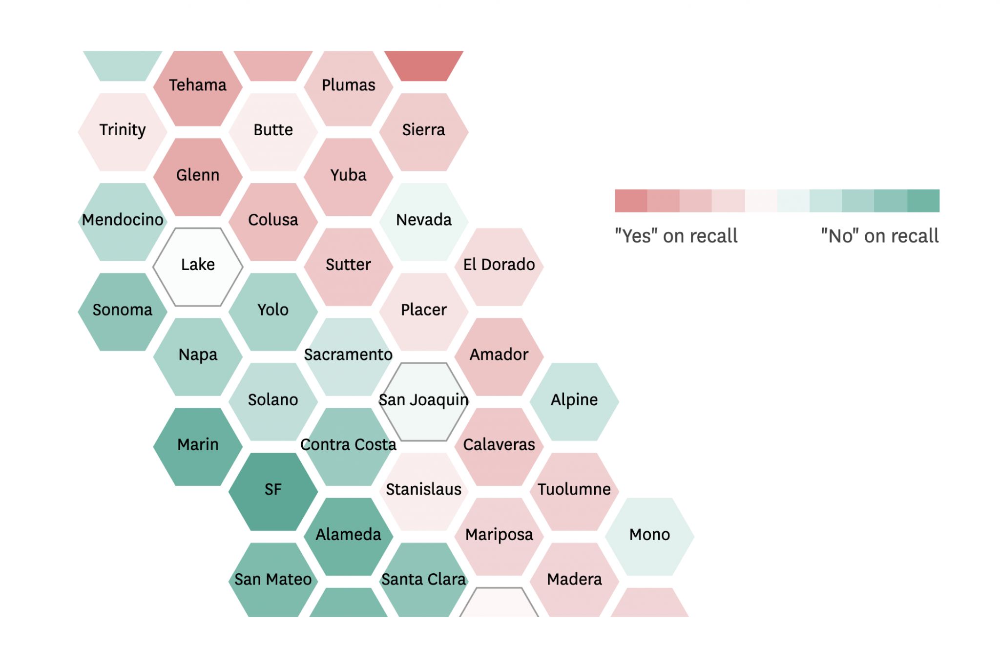
CA counties as hexagons
California state counties as a map of many rows of hexagons roughly in the shape of the state.
Click for full-map and hover-interactive version:
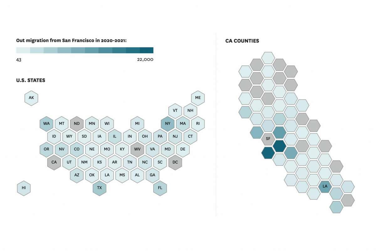
US states and CA counties
This is a combined view of different scales of a map, a coarser hexagon overview and zooming into a particular hexagon with more granular hexagons laid out in the shape of the thing that the coarser view obscured.
From https://www.sfchronicle.com/projects/2021/california-bay-area-migration-maps/
Click for hover-interactive version:
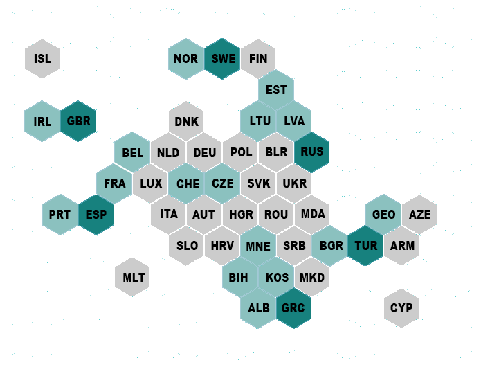
Europe and nearby countries
Coarse hexagon map of European and nearby countries.
From https://www.maartenlambrechts.com/2017/05/03/the-eurosearch-song-contest-making-of.html
Articles
- 2018-05-30
 Sebastian Greger: Self-hosting maps: taking control over UX and users’ privacy (archived) - on methods to embed external maps, using static maps, and hosting the infrastructure yourself.
See Also
- indie map
- social web map
- static maps
- useful for communicating change over areas over time, eg animated: https://twitter.com/ranjchak/status/1183723221104975872
- "I got to fit in stuff like this map of what ~150 years of colonization looks like. (Native American land loss from 1776 to 1930) which took me forever to animate so I made a gif of it" @ranjchak October 14, 2019
- another example of communicating change of 2d data over time via animated map: https://twitter.com/i_ameztoy/status/1184932194621575186
- "Weekly Arctic Sea Ice Age with Graph of Ice Age By Area: 1984 - 2019 - by NASA." @i_ameztoy October 17, 2019
- Animated (click to play) map archive page of travel: https://adactio.com/archive/2019/10/map (and backstory: https://adactio.com/journal/16058)
- ^^^ and where the idea started on Jeremy Keith's blog: https://adactio.com/journal/15992
- Open source tool for displaying maps to represent datasets: https://pitchinteractiveinc.github.io/tilegrams/
- Beware that maps embedded on sites may also be tracking you (or if you’re using a 3rd party map embedding, they might be tracking your users), e.g. now defunct example RagTag: https://web.archive.org/web/20070105010652/http://ragt.ag/
- Example of US states as circles, with each circle showing percentage data in three colors proportionately, like hollowed out pie-charts: https://www.nbcnews.com/politics/2022-elections/early-vote