create
📝
This article is a stub. You can help the IndieWeb wiki by expanding it.
create in the context of the indieweb refers to the act of and UI for creating a new post, in its simplest form, a new note, or more broadly creating anything on or for your personal site! See also:
Specific types of create UIs:
- create event
- ...
Related: creator, someone who is creating UI, design, code for their own site.
IndieWeb Examples
Barnaby Walters
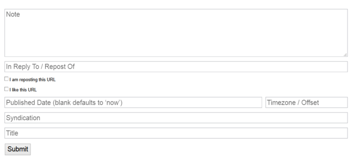
Barnaby Walters hosts a public Taproot creation interface:
For screenshots see:
Aaron Parecki
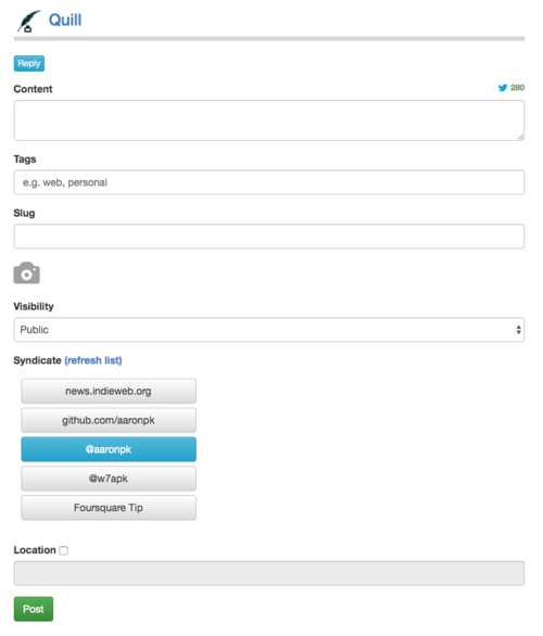
 Aaron Parecki is the creator of Quill.
Notes and Photos
Bookmarks
To bookmark a page (create a bookmark post on his own site), Aaron uses:
- a bookmarklet to activate quill.p3k.io/bookmark with the URL to bookmark pre-filled in
- quill uses micropub to
- create a bookmark post on his site.
(screenshot needed)
Previously, Aaron's software included a creation interface. Old screenshots can be seen at p3k-v1.
Tom Morris
Tom Morris uses Ferocity on tommorris.org with the following note creation interface since 2013-03-25 (or perhaps earlier)
- The circle-in-circle is for geolocation: clicking it on uses the browser geolocation API to set the location of the post.
- The tickbox for Twitter lets him decide whether to syndicate the post to Twitter or not.
Jeena
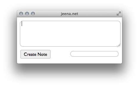
Jeena's posting interface (project unnamed)
Jeremy Keith
adactio notes
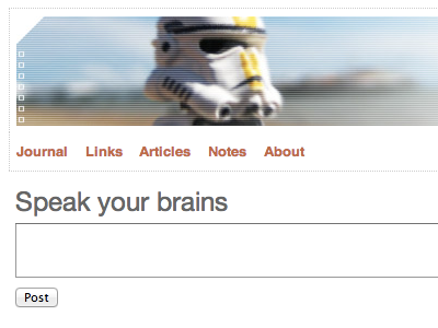
Since 2014-05-27, Jeremy Keith's note creation UI ("simple update form") on his home page when he's logged into his site adactio.com:
and adactio photos
On 2014-07-05 he added the ability to attach a photo to a note, as a way to do simple photo posts (which POSSEd to both Twitter and Flickr
You can barely see the UI with the addition of a "Choose File" HTML file input, in the second window on his laptop screen here in this photograph:
per silo POSSE toggles
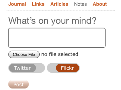
He then subsequently ~2014-10-01 added the ability to selectively (per post) toggle POSSEing to Twitter and/or Flickr (both default on).
Jeremy has also open sourced these animated sliding toggles:
- http://jsbin.com/rugonu/6/edit <-- try it for yourself
Calm Technology
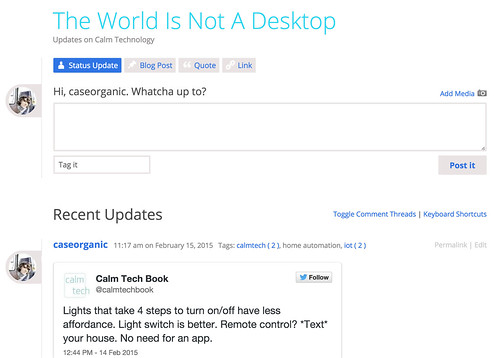
calmtechnology.com is a topic focused indieweb site by  Amber Case that runs WordPress and P2.
Note the simple one big text box with big "Post it" button as the focus of the UI, with minor optional elements to add media and tags, all inline above the most recent posts for context.
gRegor Morrill
 gRegor Morrill posts notes using this interface. For more information, see his ongoing notes documentation.
Martijn
 Martijn van der Ven’s posting UI: demoed at IWC Nürnberg.
Mobile
Mobile note creation is particularly challenging for various reasons:
- less reliable network (thus possible loss of user data if depending on JS / AJAX)
- smaller displays (less space to see what you're typing)
- touch keyboards (clumsier / less accurate than physical tactile keyboard)
Silo Examples
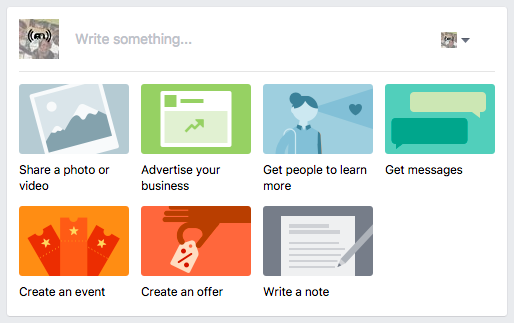
Facebook, at the top of your profile/wall "timeline" presents a UI for creating a new post with three explicit post-type options:
- Status | Photo/Video | Life Event
With "Status" chosen by default, and the prompting text: "What's on your mind?"
This is a big simplification from their past create UIs that had various post types explicitly differentiated in the UI like checkin, link/bookmark, etc.
FB activate create
If you activate the text area (where the default text is), new options are provided below it:
The icons represent (and show as tooltip text if you hover)
- "Add photos to your post"
- "Tag people in your post"
- "Add what you're doing or how you're feeling"
- "Add a location to your post" (auto-filled with a city name, and showing a close box to remove)
- "Set date and time of your post"
- Who should see this? Public, Friends, Only Me (default), Custom, school, company1, company2, ... companyN
FB Text size auto-adjust
The text area has a variable text size that depends on how long the status update you are creating is.
FB Life Event
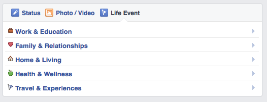
Selecting "Life Event" expands the create box into a set of categories to choose from:
- Work & Education, Family & Relationships, Home & Living, Health & Wellness, Travel & Experience
FB reselect status
If you now reselect "Status" - it activates the text field, and shows the same status options as noted above.
FB create bgcolor
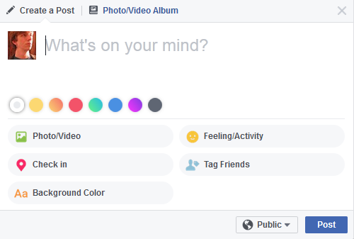
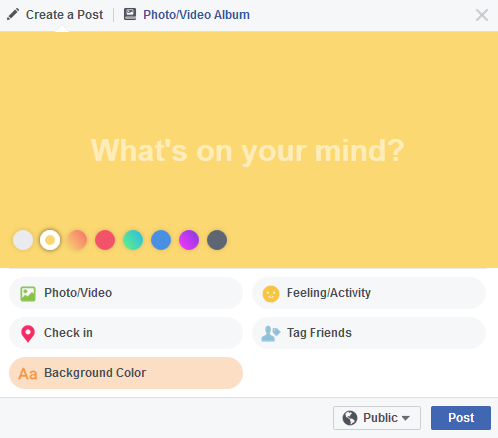
When creating from the home page instead of your profile (n.b. I found this true from profile also -  Tantek Çelik), the interface is slightly different. It also includes an option to select background color. After clicking "Background Color" you have several color options to choose:
After choosing a color, the background changes in the window:
FB create new feature
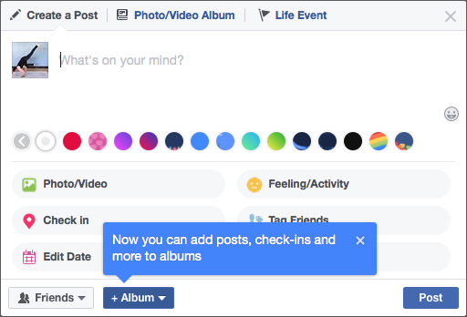
Sometimes Facebook adds a new feature to their create UI, and notifies you with a little blue mini-overlay:
Facebook Events
Noticeably absent from the above create UI is anything to do with creating events (the kind you invite people to).
Event creation UI is only present contextually, when viewing your events or your calendar.
- facebook.com/username/events ->
buttons (the pencil button is for "Manage" - not sure what that means[ + Create Event ] [ ✏️ ]
- https://facebook.com/events ->
button in the left column[ + Create ]
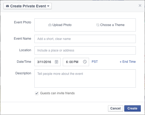
Clicking "+Create [Event]" presents a dialog to enter event details:
After the initial event has been created, the edit event UI does include an option to select an existing photo. Read more on edit#Facebook_Events.
Event public/private options:
- Private Event with "Guests can invite friends" (default)
- Private Event - only hosts can invite friends
- Public Event - anyone can view it, even without being logged in
For more details, including issues, duplicate event which itself can cause cryptic errors like "Something went wrong", "Warning Slow Down", and having events created despite error messages, see:
Google Calendar
Google Calendar has the ability to create an event from brief plain text like expressions like "Dinner tomorrow night" — need a citation / documentation of actual plain text expressions supported by Google Calendar.
Amazon Reviews
Amazon Reviews provides a UI to create reviews about products. It begins by prompting you to choose a star rating, and then progressively adds fields as you complete each step.
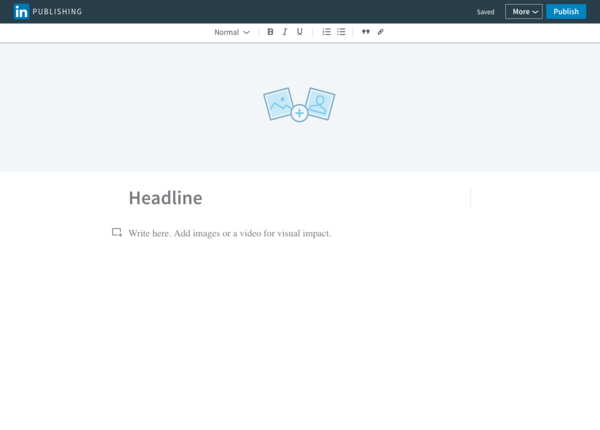
LinkedIn has a publishing interface for posting articles. It supports adding the following elements:
- upload a cover image
- headline
- post body, prompting with "Write here. Add images or a video for visual impact."
The content section allows simple formatting options:
- header level: 1, 2, 3
- bold, italic, underline
- numbered and bullet lists
- blockquotes
- hyperlinks
Brainstorming
Suggest better prose
Ideally a text-entry box would auto-suggest ways to improve your prose.
 Tantek Çelik: collecting resources and ideas in my own "Working On" here:
- ...
Photo
Some of the above #IndieWeb_Examples have photo post creation UIs inline, typically as extensions to note creation UIs.
This section is for brainstorming about photo-centric creation UIs.
Brainstorming of UIs to create photo posts.
See: photo upload for the process/challenges of uploading a photo to your server.
UI flow
A possible UI flow for a low-perceived-latency photo post creation experience:
- user chooses photo to post. web app immediately starts uploading it to the server in the bg.
- user filters / crops the photo. web app captures the sequence of filter/crop instructions, and when the user is "done" editing, web app sends that instruction sequence to the server.
- server applies the filter/crop on its end
- user adds person-tags, text content (caption) etc.
- user taps "post" or whatever, and only that text is left to send, everything else is already at the server, and the post appears *immediately*
You could maintain the sequence of filter/crop instructions purely as CSS filter and crop (width, height, object-fit:cover, object-position) properties and values, using them to display the image clientside, and serve that CSS from the server to make people's browsers do that filtering/cropping for you so you don't have to actually use ImageMagick or other server-side image manipulation software.
HTML Box
- Actual amount of metadata required for correct microformats markup is minimal but often the number of file systems required by many OSS CMS solutions complicate the workflow.
- Having a writing UI that just accepted plain HTML and required the user to include microformats2 maybe a an attractive use case.
- Would need to know how much templating to include, top level h*?
- Would want to be able to parse urls for some post types likes, bookmarks, etc
Applying Filters
Here are some libraries/resources to apply filters to images:
- http://coremob.github.io/camera/vanilla/index.html
- http://www.girliemac.com/blog/2014/03/02/filterous/
- https://una.im/CSSgram/
The CSS Filter feature allows you to do all sorts of image manipulation effects on images:
Thoughts about Tumblr editor
- Brainstorming: see both the questions (methodology, ways of thinking) and some of the strong desires in a post creation/editing UI here: 2021-12-09: https://bobaboard.tumblr.com/post/670144951687987200/ooh-i-like-cyle-now-i-want-to-hit-them-up-here-to
Offline create edit queue posts
Use-case: offline blog post writing site/app on an iPad
Native app equivalent: the built-in iOS Notes app can be used to write, save, expand drafts until they have enough content/structure to start marking them up, adding relevant images etc
Related:
- Notion
- Criticism: requires you to login (requires network access) every 90 days. problem acknowledged.
- local first
- offline first
Brainstorm design:
- with a Service Worker, it should be possible to create a Notes-app like UI with a website where you could 100% edit/save offline and when you happened to reconnect to a network, "sync" with your own server
- that alone would be so useful that it must already exist, like with as clean a UX as Notes app (CSS to imitate that really shouldn't be that difficult). and I mean "simple" text notes, not all the fancy objects and crap they've added the past few years
- Previous thinking from
 Ryan Barrett: https://snarfed.org/posting-to-the-indieweb-from-your-phone
 - YouTube tutorial to build a JS/Localstorage "Notes" app: https://www.youtube.com/watch?v=01YKQmia2Jw
- Minimal HTML+CSS+JS for a JS/Localstorage "Notes" app: https://github.com/dcode-youtube/notes-app-javascript-localstorage/tree/main
- Previous thinking from
- having "Publish" be a distinct separate action which then "froze" the note and queued for publishing would be great. of course with the whole life cycle of letting you auto-unfreeze the note to keep editing it (obviously pulled off the publishing queue as well)
- when you happen to connect to the network again, it could auto-micropub publish the queued notes
- enhancement to set a publishing "time window" say if you only wanted the notes auto-published during your personal daylight hours. and enhance that with Buffer-like specific publication time queuing (AKA scheduled post)
See Also
- posting interface
- UI
- note
- posts
- creator
- projects
- mew
- 2023-09-22 Template:scottjenson: The invisible problem
Text editing on mobile isn’t ok. It’s actually much worse than you think, an invisible problem very few appreciate. I wrote this post so you can understand why it’s so important.
- useful for making ASCII tables (suitable for monospace displays like inside pre tags) https://www.tablesgenerator.com/
- capjamesg's publishing workflow, and more explorations into his workflow
- Brainstorming:
 Tantek Çelik: consider user-forgiving content creation interfaces, in addition to being user-friendly. E.g. supporting undo, providing a delay before syndicating to uneditable destinations (whether POSSE to silos, or to feed files destined to be cached by older reader software that does not update posts after it finds them)
